


Introduction
Analyzing health data in power bi is both an important and complex task. With the right data, and the right analysis, public health officials can have a better understanding of the scope and impact of the outbreaks of diseases and make informed decisions on how to address them. This is week two of Bootcamp and team three (3) was pleased to work on the health insight analysis of Cholera and COVID-19 (Italy). The task was both challenging and rewarding. The following paragraphs detail our steps and analysis of the two datasets which were worked on.
Data Collection (COVID-19 and Cholera)
The data sets were collected from the Kaggle database. See the end of the write-up for reference links. The team agreed on the Cholera and COVID-19 (Italy) datasets. These datasets were downloaded and saved in a folder. There were about 7 Files in the folder of the COVID-19 dataset. Four (4) files that we found relevant based on the requirements of our Dashboard were selected. On the other hand, the cholera dataset had only one file which we used.
Cleaning steps on COVID-19 Data
The following steps were taken to clean and prepare the COVID-19 datasets:
We carefully observed each column and the columns not needed were removed from each file.
All files were checked to find the columns which are common to them. We found the Region column to be the common column. The file which was found with complete regional data was duplicated and renamed as Region.
All other columns in the newly created Region file were removed except for the Region and Region Code columns. The duplicates were removed to have unique regional data that can filter through our visualizations.
All files which had “_cases” attached to the region name; for example “Piemonth_cases” had “_cases” replaced with space.
We required a date that could search through all of the files simultaneously. The three (3) files with the name date were therefore replicated and given the names date1, date2, and date3. In the replicated files, we simply kept the date and deleted all other columns. Using the SPLIT button on power Query, the date column was divided into dates as it had both Date and Time data. This was done for every file that had a date in it as well. Using Power Query's APPEND button, the individual dates; date1, date2, and date3 were added as a new file and given the name DATE. Duplicate data was eliminated after appending so that we could have a unique date that could filter through all of our reports.
One of the files (The Age File) had the regions as columns. We unpivoted the columns so as to have them as rows. All of the columns to unpivot were selected, then we right-clicked and select the Unpivot option.
The Relationships on COVID Data
Relationships were created with the created Region and Date File. All files with the region in them were connected to the newly created Region file and all files with the date were connected to the newly created Date file. See the relationship chart below.
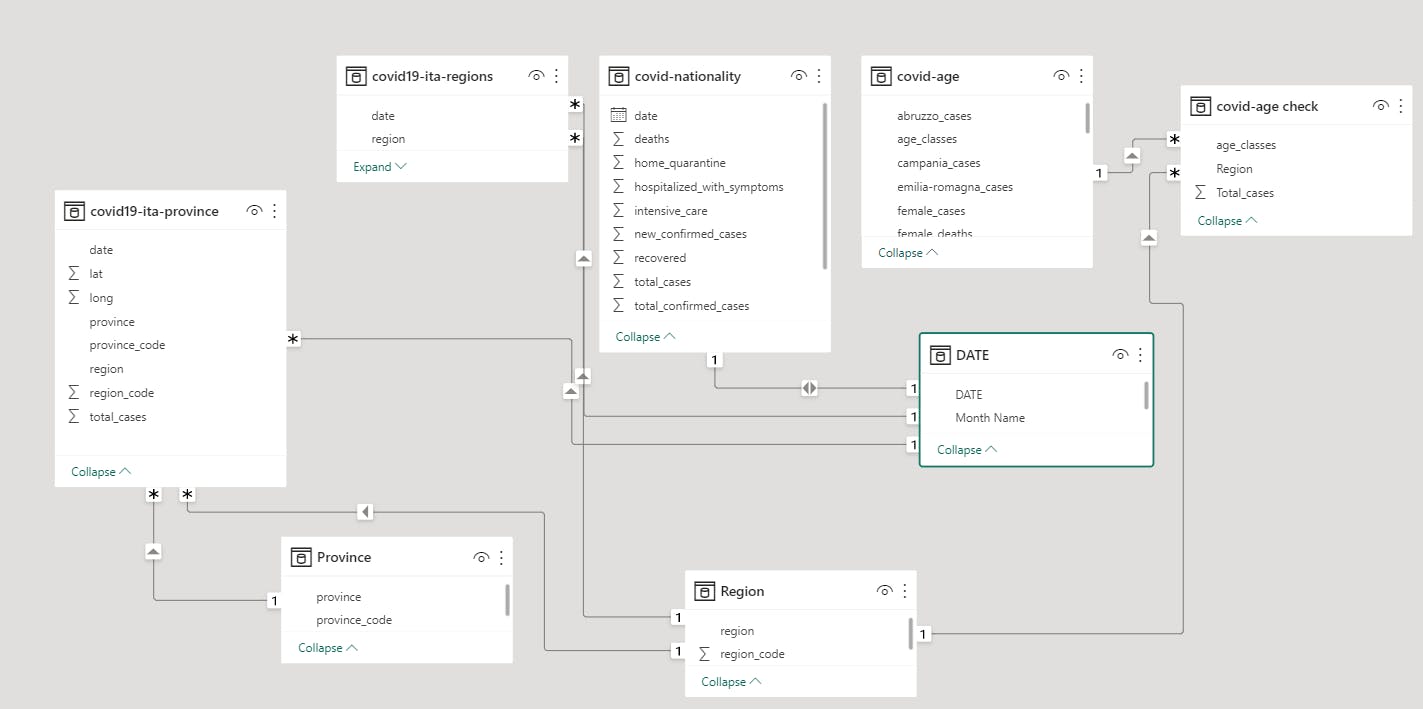
Figure 1: Relationship Chart of COVID-19 Data
Analyzing and Visualising
- New measures were created to count the number of Regions and Countries. The image below shows the function which was used.
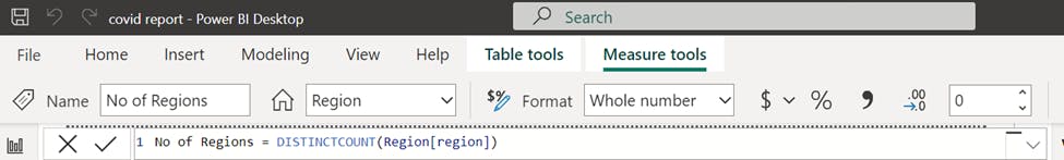
Figure 2: Image of DAX formula used to count regions.
- Insights to be visualized were first noted down, then tables were made to represent each insight. Sheets with the table were duplicated and renamed as the visualization page. The tables were then converted to desired charts. See the image of the tables created below.

Figure 3: COVID-19 Tables
- Each chart was arranged properly and there was careful selection formatted to help communicate efficiently and tell a story. See figure 4 below for our final Dashboard for the COVID-19 datasets.
Observations and Comments
We observed that the Lombardia Region had the highest sum of death whilst the Umbria, Basilicata, and Molise Regions had the least sum of death. This could be attributed to the small number of provinces. We also noticed that people between the ages of 50-59 had more reported cases and possibly more deaths. The number of regions was 21 in all and the provinces were 108 in total. The death rate was 12. The total number of cases reported was 6.77 million, the total number of confirmed cases was 4.27 million and the total number of deaths was 0.85 million, this brought a death rate of 12.5% which can be considered relatively low. This suggests that Italy did a good job managing COVID-19.

Figure 4: COVID-19 Dashboard for Italy
Cleaning steps on Cholera Data
The following paragraphs detail the steps taken to clean the Cholera dataset before analysis and visualization.
The cleaning of the datasets was done in power query by filtering out the errors and replacing null values with 0.
The team ensured that each column had the right data type.
Measures were created to show the number of countries present in each WHO region and the death rate since they are needed in the Visualization.
Analysis and Visualisation
Insights to be crafted out as visualizations were drafted in a textbox on Power BI and for each listed draft, a table was created. The sheet containing the tables was duplicated and each table was converted to a suitable chart that passes the right message across. See the tables chart below:
Figure 5: Cholera data tables
For the visualization, a line chart, filter chat, funnel chart, clustered bar chart, cards, and a gauge were used. The Visualizations were properly arranged to tell a story with appropriate fonts and colors. See the final Dashboard in Figure 6 below.

Figure 6: Final Dashboard for Cholera
Observations and Comments
Of all the WHO regions, Africa and South East Asia reported the highest number of Cholera cases between the years 1970 and 2016. South East Asia however had the highest number of deaths as compared to Africa. The line chart showed that the number of deaths was reducing as the years progressed and so were the reported cases. This shows that a lot of work has been done by the WHO to eradicate cholera. The European region collectively reported the least number of cases and deaths which suggested they may have managed the disease very well. The top 5 countries with reported deaths from highest to lowest are India, Bangladesh, Indonesia, the Democratic Republic of Congo, and Nigeria.
Conclusion
This week’s task was challenging and exciting. From the struggle to find suitable datasets to coming together as a team irrespective of our individual challenges and time zones. This has been another learning curve and we hope to do more in the next week.
References
1. COVID-19 Italy dataset link (https://www.kaggle.com/datasets/virosky/italy-covid19)
- Cholera dataset link (https://www.kaggle.com/datasets/imdevskp/cholera-dataset)